UX / UI Design
Project Overview
I have designed a range of brochure websites, and landing pages which merge Graphic design, UI, and UX design. Here are some of the projects I have worked on, including Salesfire's most recent website re-brand, Domino's pizza, Anytime fitness and more. The global franchises I have worked for require a high level of attention to detail when sticking to the brand guidelines.
My Contributions
I was the lead UI designer at Viral Effect, so I had artistic control to design most of these Brochure sites.
I had to collaborate with the Dev team to get the sites up and running, most were housed on CMS, or custom made solutions.
This also resulted in sometimes having to lead the client through how to use the sites and be quite client facing in some scenarios.
I have also worked with a lot of self builders to create designs in Wordpress using some HTML and CSS knowledge.Some of the sites I have worked on:https://www.salesfire.co.uk/https://viraleffect.com/https://letsdopizza.co.uk/https://referrey.com/loginhttps://raczcommunityfund.co.uk/
Product Design
Project Overview
Digital Assistant is a conversion rate optimisation tool that sits on e-commerce websites.
It was created to be the biggest tool in Salesfire's product range, and therefore has the most moving parts, features, and customisation options. This means it has a large dashboard where people can set up their product, as well as a front end.
My Contributions
I worked heavily on products within this larger project dealing with B2B and B2C, and worked with 2 other designers, a team of engineers and a UX writer to scope out stories, and work. This ranged from interaction design, Wireframing, prototyping, interaction, UI and UX design.

I worked on the Digital Assistant dashboard that had to be accessible for a first time user, as well as an acclimatised user of the site. The need for self serve software had increased because of the number of users, so we needed to include more videos, and ways the user could navigate the product alone.
We wanted an 'app store' of products, so I set about Wireframing and sketching some ideas for the Digital Assistant dashboard. The process worked with a team of UX designers, and Engineers. I lead small stories within the larger story, as well as helping out with the design system.
Overall the new dashboard worked a lot better to show the products, and the range of options available for self serve clients. It increased the number of campaigns being made, as well as improving the overall UX and Accessibility.


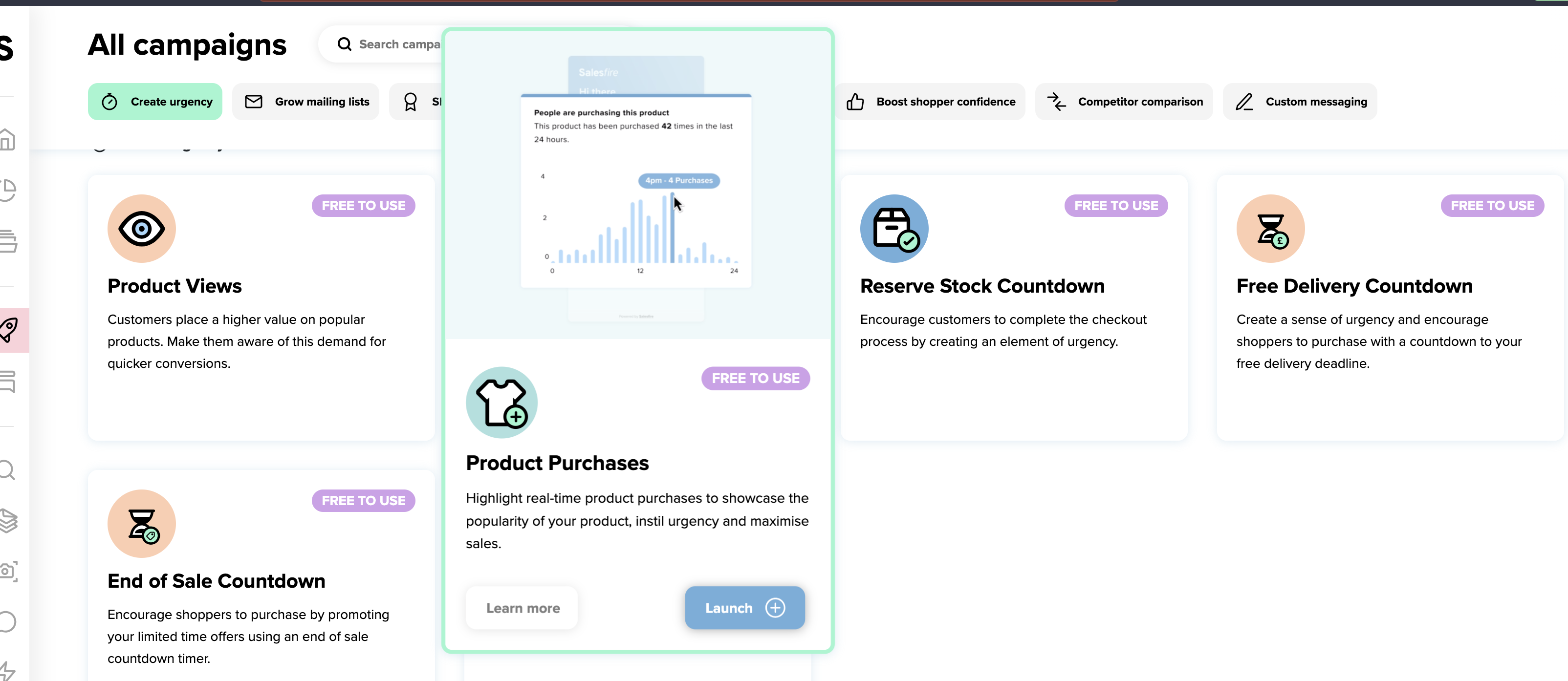

The brief was to make a dashboard page to showcase the featured products, and also have a section for first time users to show them the main products that were available. I sketched out some ideas, then moved to more high fidelity wireframes with existing assets to show it to the CEO.
We settled on a two part hero that showed a first time user a video on the main products, and then it moved to a featured campaign slider, which would update from time to time showing the most recent and popular campaigns.
The new hero design made for an increase of campaigns being launched, and it was a good way to showcase lesser-used products that we felt would be good for users across the board. We also introduced tabs that indicated what the products would be best used for, such as free to use, this increased the usage of some products.

Users were requesting a way to merchandise their items in bulk, and group them together for instance to show them in a 'bought together' tab.
I scoped this project with the lead engineer to figure out what was needed, because we needed to show the products that were merchandised in a catalogue, a new merchandising tab, and an expanded product tab.
I wireframed the design after it was figured out what was needed. I worked closely with the SDR on the project, and figured out what would work by using a case study from a client. We came to a conclusion which I presented the wireframe to the CEO and the development team which we worked in an agile project management way.
The solution solved all of the issues that were raised, and worked in a user friendly way. It made it easier for the few users who wanted to merchandise their products in bulk, and not do it all separately.
It also made other users of the product be able to access the functionality.

The brief was to update the UI and UX of the Salesfire website. I worked as a UI Designer for this project and created low fidelity wireframes and sketches to the stakeholders.
This was a fun project to work on, and I created a lot of the graphics for the site, as well as some Interaction design elements. The new UX that was implemented went into defining the design system.
The sleek and modern design of the new websites now highlights the products a lot better, and the added interactions make for a much more interesting and attractive website.


Salesfire needed an installation modal that would appear if a user had not set up their site with the appropriate code to merge their commerce feed. I was the one that scoped this with the CTO, and wireframed a lot of ideas to figure out what we did and did not need to make it work.
I realised what was important was user feedback, and along every step of the way informing the user of their progress, we did this with colour coding and icons, which were then set in the design system of ways of informing the user.
This was a great success and took a lot of pressure off the phone support team, as users could follow the guide and install Salesfire themselves, or get a dev to do it because of the send to my developer option.

In addition to this there was a need for a help guide for the users setting up their campaigns, so I designed a small help banner. This was an important point for Accessibility, as we were aware there are multiple different types of learners, and visual learning helps some people learn.
Looking at a range of website builders, I sketched out a process of a three step help banner that would appear, and scroll as the user scrolled down the page. I also created mini help animations that would aid the user, with a block of text that described the process.
Ultimately, this improved the self serve aspect of the site, the ease of use for first time users, and for our core user group, it was useful to add any new aspects that may have appeared in the product.
The format of the help banners will be rolled through the site for upcoming products that are to be launched.


There was quite a tight time constraint on this project, which was quite difficult, given its complexity. We had to create these scrollable product modals, and a lot of new design system assets. Which was a lot to do!
In this aswell, I made sure the design system was tidy and organised, as it can soon become overwhelming.
We decided splitting this into three sections would be best, and have slightly different ways of excluding would be the best approach.
I worked with developers and SDR’s to scope out a solution for the problem. The idea was to have a modal to exclude the products and then a bulk option to exclude if there were brands or categories. Because of these slight differences in functionality this turned out to be a complex UX design problem, which I lead from start to end in a small team of designers. I also worked heavily on a prototype, as it was hard to explain to stakeholders such as the CEO and CTO how it worked without a prototype.
The result worked very well for the project, and was great in retaining those customers who needed this functionality to stay with Digital Assistant as a product, so it helped to retain, and add customers.
The design challenge was fun, and I believe I came to the best possible solution for the amount of functionality and features.


The brief was to reskin the Referrey Dashboard, and add in key validation states and UX elements that the site was lacking. This was a link referral site.
Using Figma, and sketches I wireframed then prototyped this project. It had a tight turnaround of 1 week, so the constraints meant there was not much time as there was just me working on the project.
The design worked a lot better and the added validation and error states meant people could now recover their passwords easier and use the site more than previous versions.

In 2021 I was given the task of redesigning the Anytime Fitness website for franchisees in the UK. This was a fun project, and the scoping and designing side took about 4 weeks. I worked in a team with 1 UX writer and 1 Developer, and I was the only designer working on the project.

The aim of this website was to promote a charity that would give out funding to good causes. I scoped out what was needed and worked closely with the content team to figure out what we would need. It needed to be very visual and the form needed to be user friendly to get users to sign up their charity.

I worked with Dominos Pizza to create a website that sold corporate gift cards to businesses. It needed to stay within the strict brand guidelines of Dominos Pizza, but also introduced the gift card assets which I also created. This was a successful website and opened up a lot of B2B sales for the company.

This was a website I designed for a new bar in Middlesbrough, England. They had a clear idea of font they wanted to use but not much more in the way of ideas. I worked with the business and liaised with the owners to scope out what look they were going for with the website.

I worked on the Homesdirect365 site and added in elements of design to it, including increasing SEO with copy and link sites.
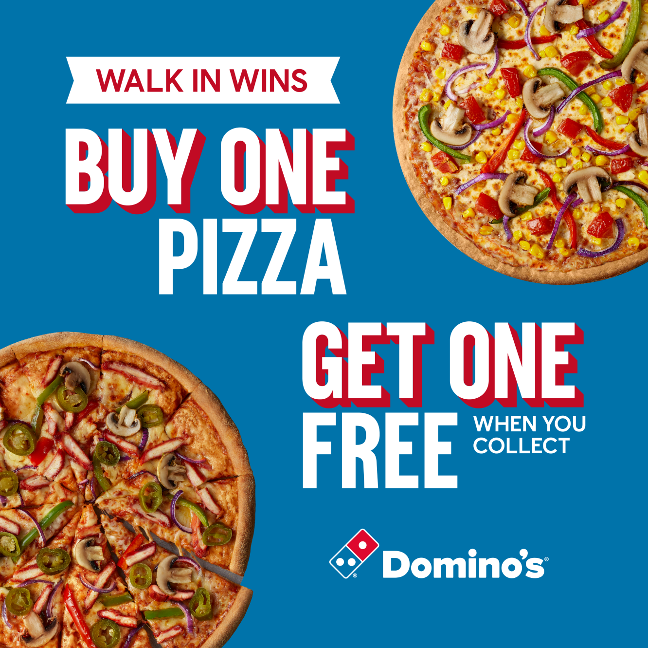
I also created social media assets for Dominoes Pizza that would go on their socials, this was fun to switch it up a little bit from website design to do a bit of graphic design which I did not have as much experience with.
