This was a data-driven redesign project that leveraged E-commerce insights from 570,000,000 user journeys and £1.5 billion eCommerce revenue.

4 months
UX design lead
UX writer
Engineering
Figma, User Testing and research
The redesign was driven by the need to transform a technically valuable but hard‑to‑use analytics platform into a more intuitive, efficient, and client‑friendly experience.
The original product suffered from:
1 - Overly abstract screens
2 - Weak onboarding
3 - Data‑heavy interfaces that made it difficult for users to extract insights.
The redesign improved usability, accessibility, and engagement, enabling users to find and interpret trends more quickly and effectively.

Beyond improving the UI, this was a chance to elevate the overall UX. I mapped key elements within the FRE and user journey, using storyboarding and wireframing to pinpoint improvements and create a more intuitive, seamless experience.

Divided the platform into three main pages, each optimised to present data clearly and engagingly for clients.
Designed the logged-in experience and onboarding flow to ensure a seamless, intuitive entry into Salesfire Trends.
Mapped the navigation and wireframed the three key pages, focusing on making complex, data-dense insights feel clear, usable, and visually engaging.

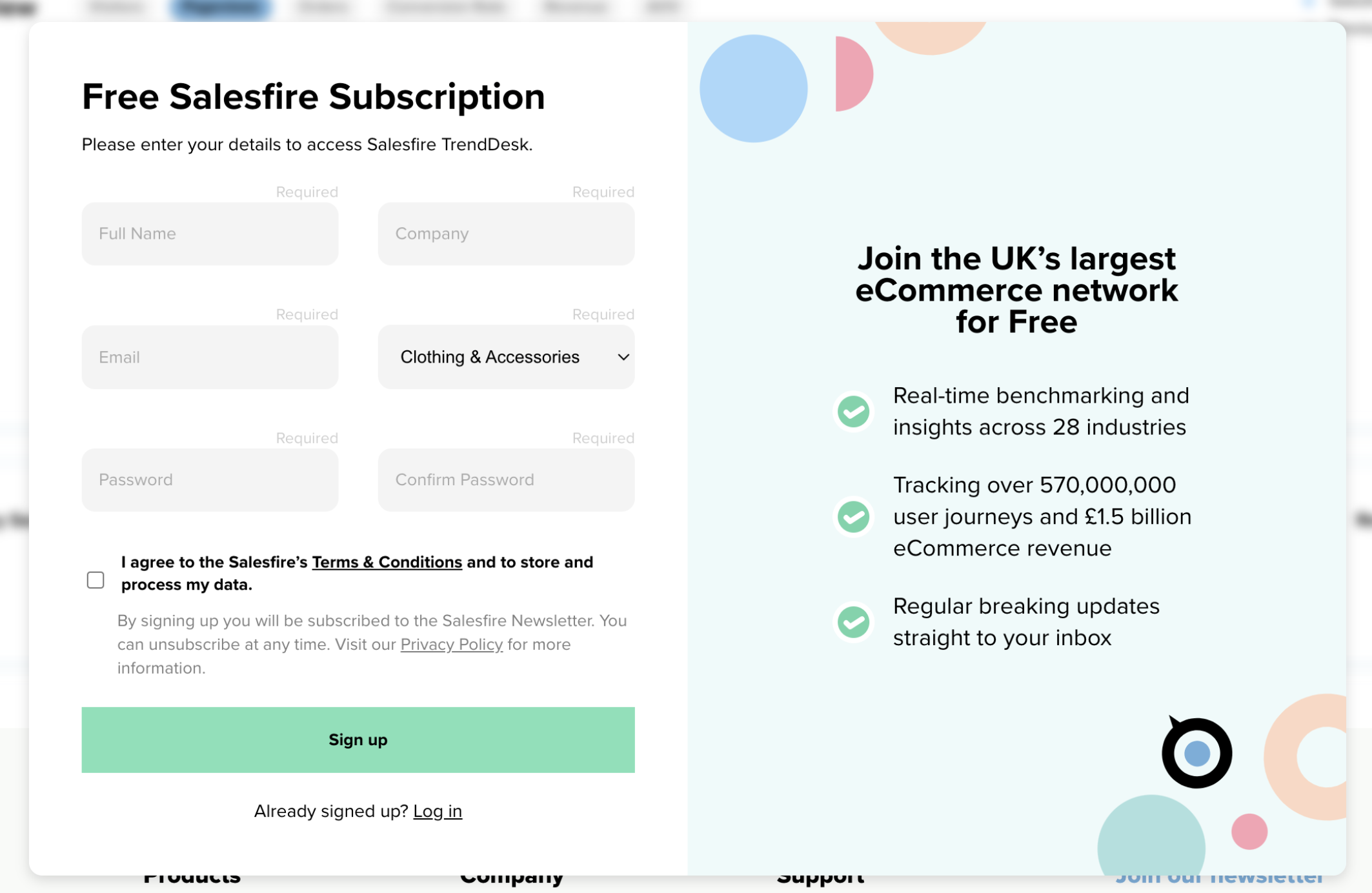
The original sign-up modal needed a redesign to better support the first-run experience.
The flow lacked key usability foundations, including clear validation, error messaging, and distinct log in versus sign up pathways.
In the updated design, I introduced accessible form feedback through improved focus states, contrast, keyboard navigation, and inline validation to guide users more confidently through onboarding.
I also shifted emphasis away from USP-heavy content toward a cleaner, more user-centred layout. These improvements helped reduce friction early in the journey and contributed to a noticeable decrease in support tickets related to sign-up issues.
(Original experience)

For the News page, I wanted to create a sense of a constantly updating, live feed of e-commerce stories and insights.
I drew inspiration from global news and newspaper-style layouts to capture the feeling of fresh, rolling content while maintaining a clear editorial hierarchy.
Designing this interface was an opportunity to balance engagement with readability, using the news content itself as the primary visual focus rather than relying on a traditional hero.
Accessibility was central throughout the process — early hero concepts introduced contrast and legibility issues, so we iterated toward a more WCAG-compliant solution with stronger readability and improved contrast for all users.

This was a really fun UX challenge: designing a calendar component that let users compare time periods or select a custom date range.
My first concept split these options across separate fields, but it felt fragmented and increased cognitive load.
I iterated toward a single, unified menu that supported all comparison modes in one place, creating a more intuitive and cohesive experience.
Building the components in Figma was one of the more complex parts of the project, requiring a scalable auto-layout system with multiple selected states.
The final solution improved usability, worked seamlessly within the design system, and provided a much better mobile-first experience by keeping interactions consolidated and easy to navigate.
.gif)


The design system for the most part was hand crafted by me, as we did not have preexisting graph components, or for the calendar picker. This broughts its own challenges but was incredibly rewarding to build a design system from scratch.
- The redesign drove a significant increase in platform traffic following launch, with Salesfire Trends continuing to be actively used for e-commerce insight reporting today.
- Improved user efficiency, with time-to-data reduced by 58%, measured through a combination of user testing and performance analytics.
- Increased engagement through clearer navigation and richer interaction patterns, resulting in longer visit time and deeper exploration of insights.
- Key components such as the three-tab structure and interactive chart navigation saw higher levels of correct usage, alongside improved click-through and interaction rates.
- Implemented ongoing feedback loops using Typeform surveys and Hotjar heatmaps, confirming stronger usability and discoverability post-launch.
Qualitative customer feedback highlighted a cleaner dashboard experience and that insights were easier to find and interpret.
At Salesfire I worked with SaaS CRO products, helping optimise e-commerce performance by leveraging behavioural data, personalisation, and automated engagement tools to increase conversion rates and revenue for online retailers.
(Right) is an example of the help center I created to help users onboard and answer questions.

I created a B2B product exclusions tab for products that needed excluding from certain product categories or groups.
This could be excluding from search, categories or brand search.

This is the E-commerce product page which listed all of the products and tools that are available to the user.
It had to be clear, usable and accessible for users to want to engage with the software.
There had to be a focus on education, and upselling the value prop for each feature.
I created interactive states and video elements for all of them so the user could have an overview how they worked.
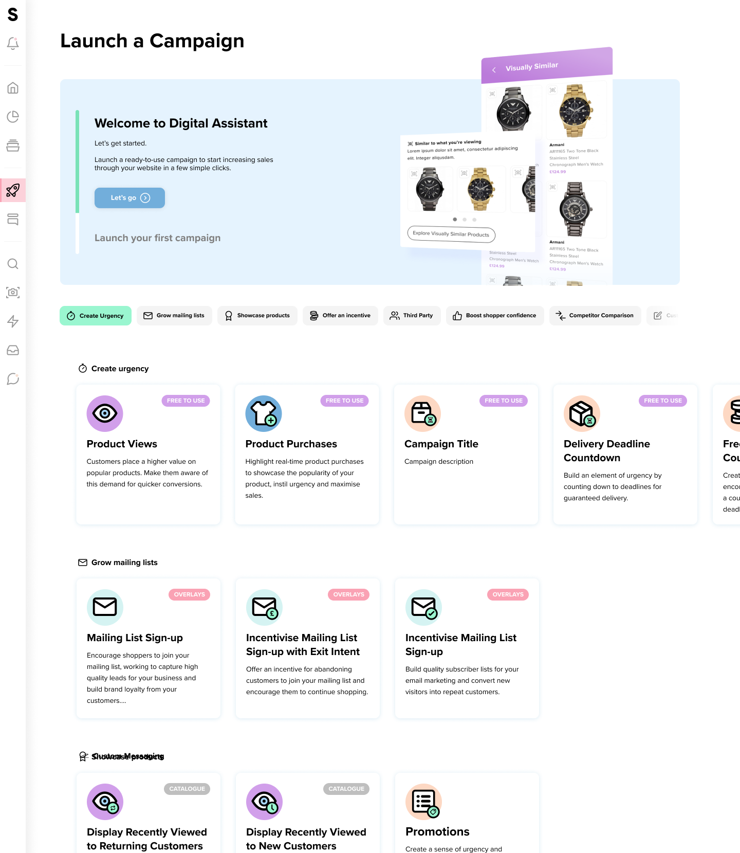
I designed and launched an Academy-style learning platform to help customers better understand the product and get the most value from it.
The platform provided structured guidance on key workflows, including onboarding, campaign setup, and best-practice usage, enabling users to become more confident and self-sufficient while improving overall adoption and engagement.
Lowering support calls in onboarding by 57%

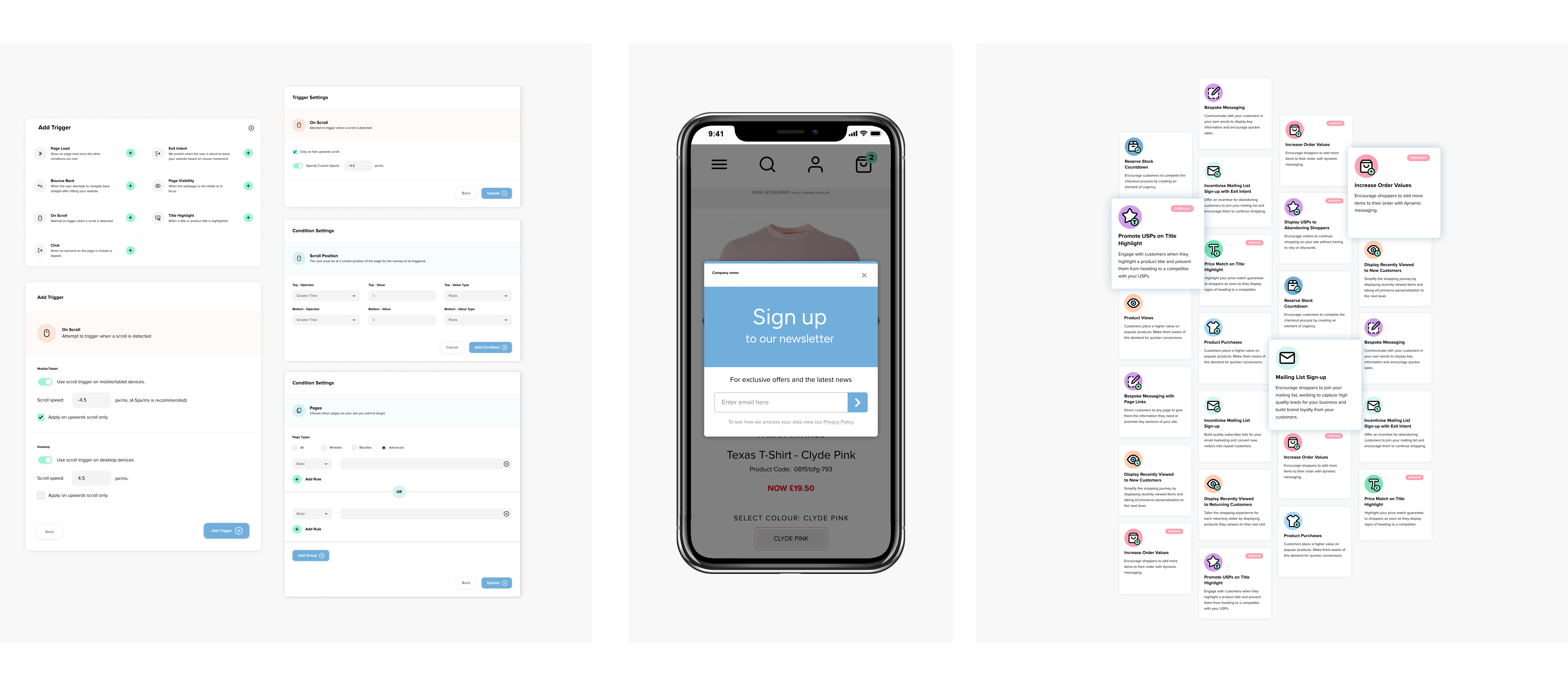
I led the design of complex settings and trigger systems across multiple products, which was one of the most challenging areas of the platform. For eCommerce CRO tools —-including AI-enabled features - this meant translating sophisticated logic into clear, usable controls, allowing customers to configure campaigns, automation, and personalisation without added friction.
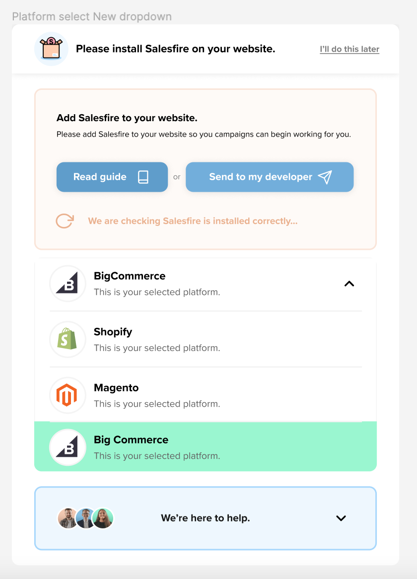
A way to self onboard was vital to this SAAS company to lower support tickets and times.
I was tasked with creating a self onboarding screen which aided the user in selecting their platform and istalling.
It needed:
-A way to read installation guidelines
-Send to developer button
-Choose platform
-Help details
The final product reduced support tickets significantly.