As AI and new feature surfaces emerged across Microsoft Edge, I focused on strengthening the accessibility and usability foundations of the design system. My work centred on colour, contrast, and system guidelines - ensuring that evolving UI patterns remained accessible, consistent, and safe to scale across teams.
This was not ownership of the full design system, but targeted stewardship of high-impact system inputs that shaped multiple product surfaces

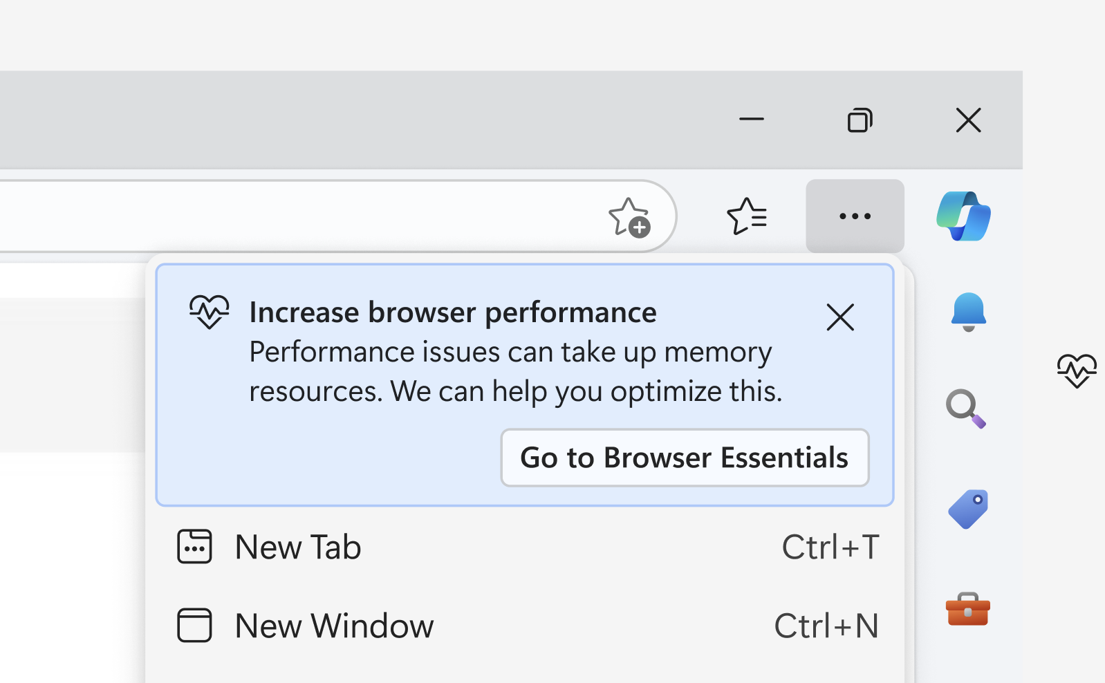
Customer feedback showed that the range of colors on offer were inaccessible for users, and they wished for more flexibility with the colors on offer. Some wanted a custom color while others just wanted the current set to be nicer. I hypothesised that adding the option to add a custom color to tab groups in edge would solve a lot of the issues, but also that defining a new palette for the AI age would also feel like a needed upgrade.
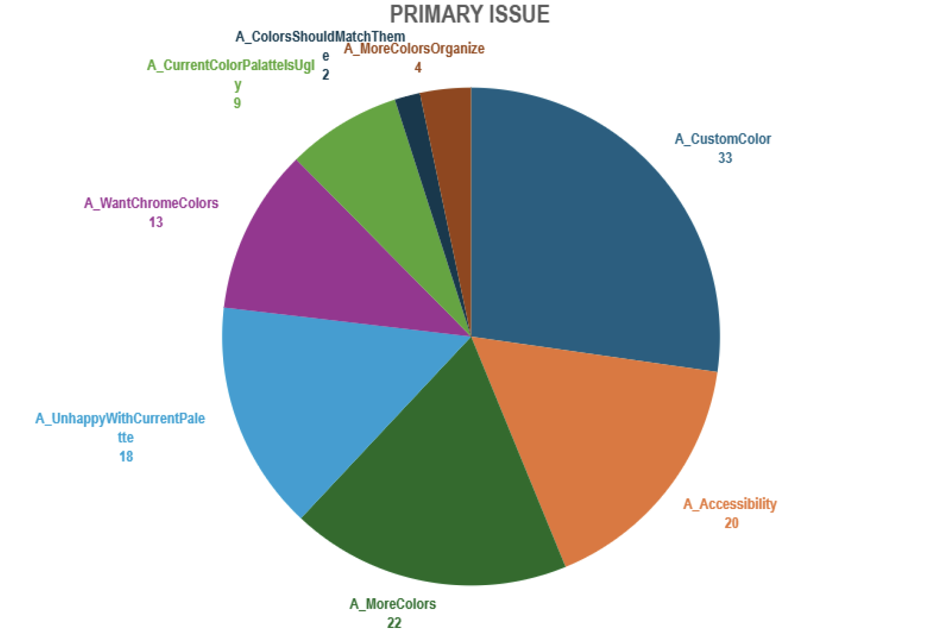
User feedback from a number of research methods showed there was clear feedback the current colors were somewhat inaccessible. This lead me to figure out a number of issues and potential gaps to fix.
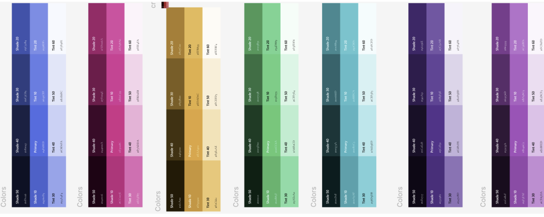
To ensure AI and workspace UI patterns remained readable and safe, I evaluated all proposed colour combinations against WCAG AA contrast thresholds. Several high-emphasis states initially failed for low-vision users, risking misinterpretation of warnings or key actions. I recommended adjusted palettes and accenting strategies that passed contrast requirements, reducing cognitive friction and preventing user errors across Edge surfaces. Naturally some more expressive UI was intentionally constrained due to accessibility risk.
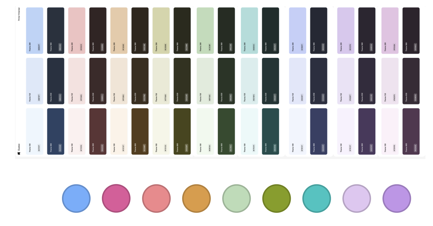
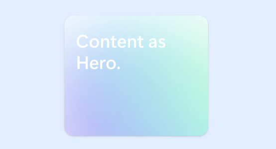
In the end I settled with a palette that aligned other areas of the product and AI space and edge. The colors would future proof edge for the time being and felt a lot lighter, and less muddy. These would be used to auto populate AI tab grouping, so needed to feel light and delightful.
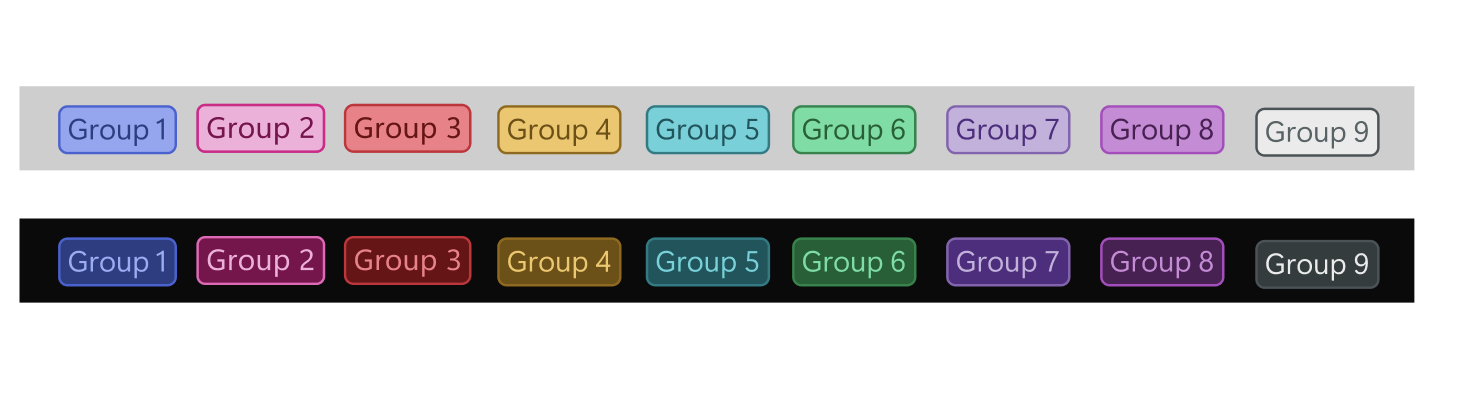
The palette that actually passed to the highest level was somewhat a design trade off as it did not score as well in AB testing with some users as it didn't feel quite the edge brand. This being said it was an incredibly intricate and interesting use of my time to think about color theory, accessibility at such a granular level.
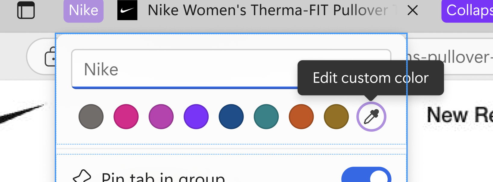
Adding a custom color to the picker button gave users that extra level of customisation that they wanted. For some users this was the top solution for the issue of color contrast. This was an example of listening to direct user feedback and giving them what they wanted.

This lead me to create Edge color guidelines which you can find online. There is a comprehensive design style guide on color in edge as a designer and using it in the right way.
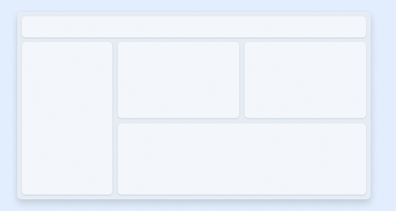
With the integration of AI elements, guidelines became more important, keeping up to date with changes within the design system was paramount. I penned a bunch of guidelines for components in edge, and also defined some design decisions for labels, badges, simplified ui imagery and more.
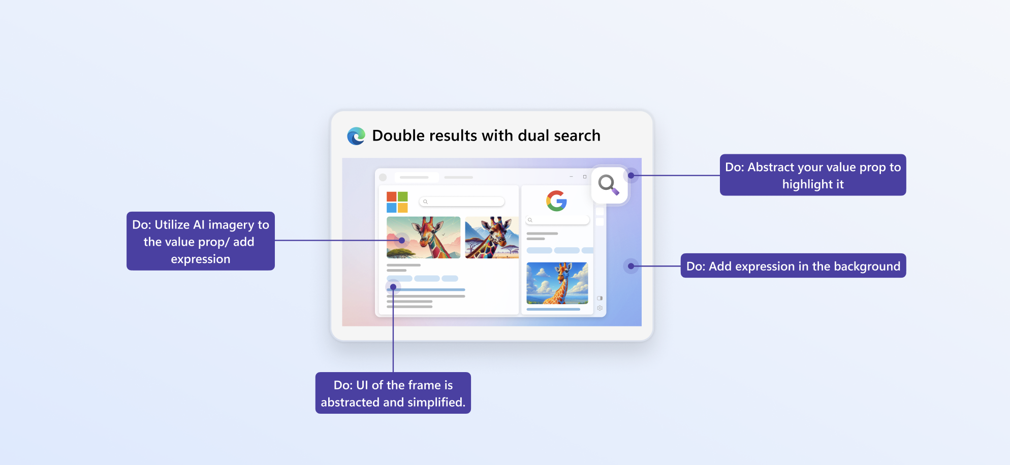
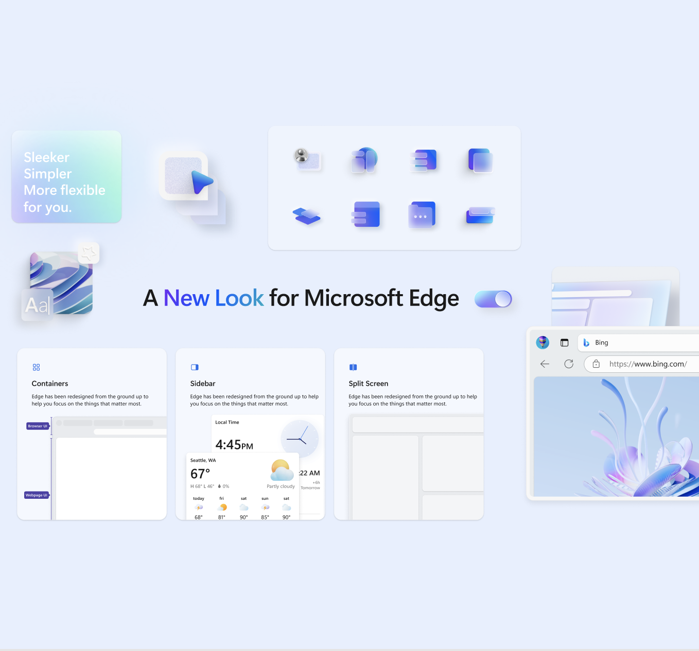
I worked on defining Simplify UI, whereby we simplified down illustrations and utilised AI to make them look exciting. This style has been continued in other areas of the product and beyond now, and works at scale because it does not require much localisation. It improves consistency and is more direct and functional.
The guidelines made decision making easier, and we found an improvement in our team, and partner teams working from them and referencing them. This enhanced designers decision making and made the team more harmonious. Any revisions were welcome and I had many crits on my work to see if we could find any edge-cases etc.
Alignment with Engineering and PMs increased as they could also reference this source of truth. It gave newcomers to the product a great jumping off point, and partner teams like copilot some context for when they were designing in our space, or vice-versa.
Churn in our own team reduced, especially with new starters who were not sure on certain components, it was a great tool to have to align.
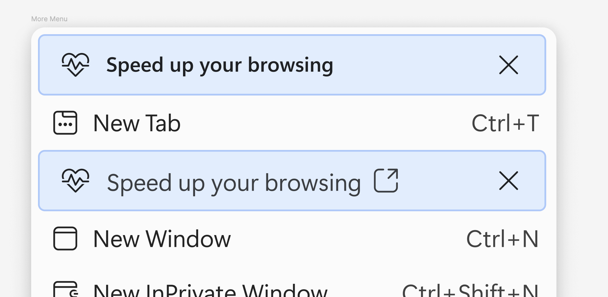
Here is an example of a gap I identified in the design system and subsequently justified and added a new type of menu item into the Design system.
Previously we had a variation of a 'message bar' that could be essentially fashioned into the shape of a menu, but for the use case I found it did not fit with the style nor alignment of the menu.
My proposal was a new variation of a menu item that uses the same branding colors but the function would be slightly different.
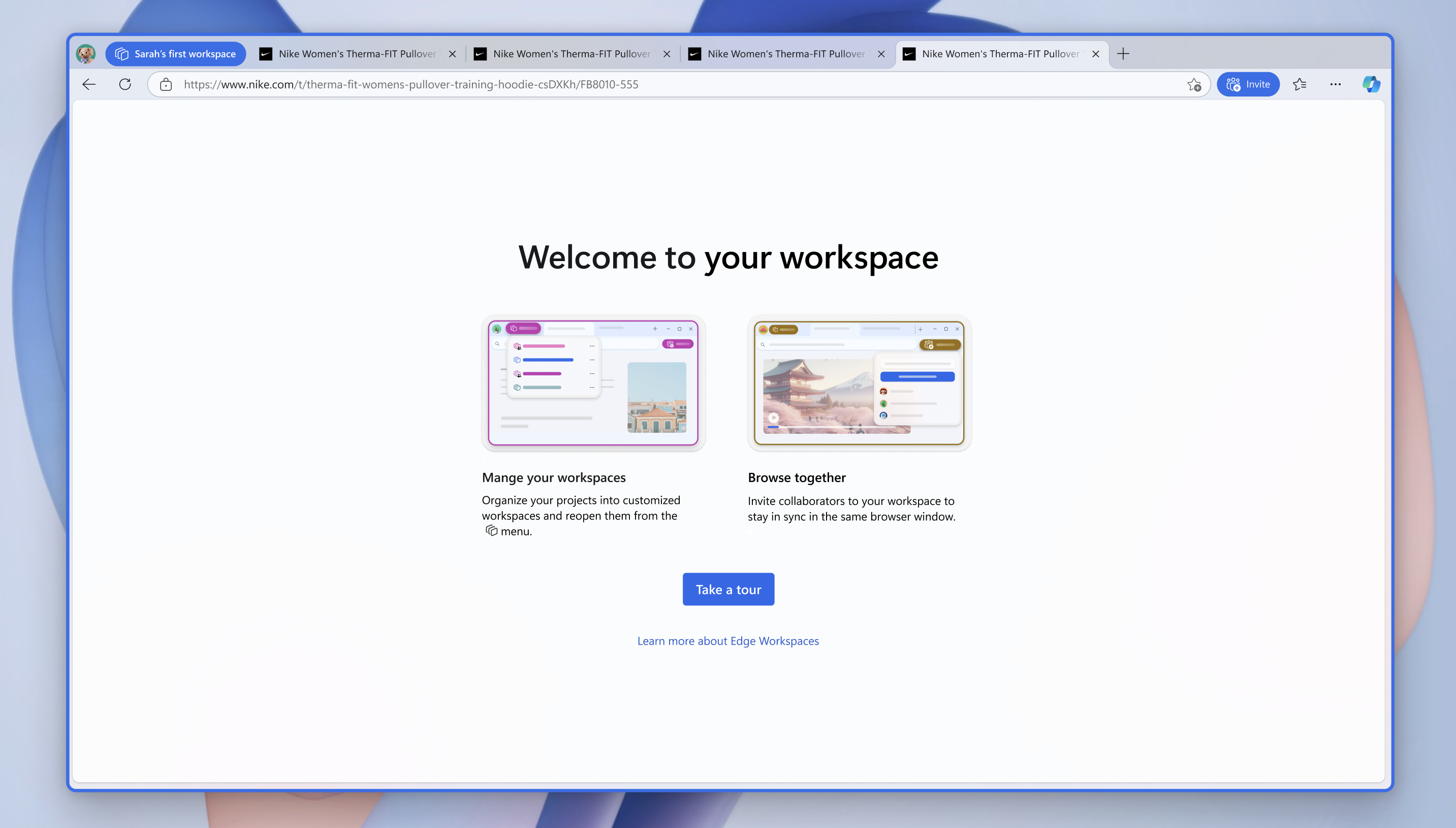
I led a growth pod for six months, running end-to-end experiments with selected user groups, including A/B rollouts to gather insights. My work focused on increasing daily active usage in Microsoft Edge, both by encouraging Windows users who defaulted to Chrome to try Edge, and by helping existing users better understand underused features.
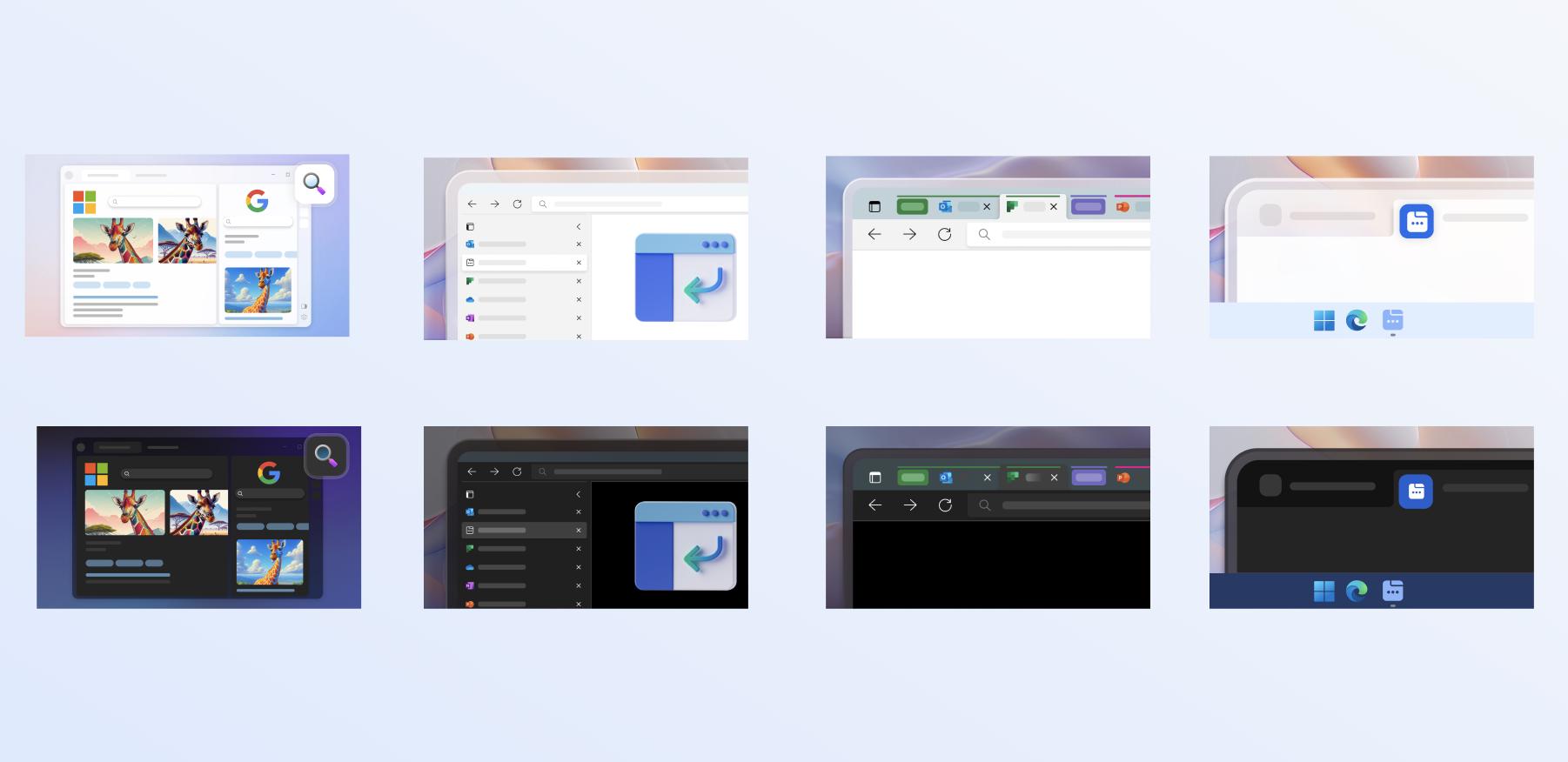
These experiments informed broader product updates. The examples shown here are educational screens introducing Workspaces, one of which has since shipped and contributed to increased daily active use.
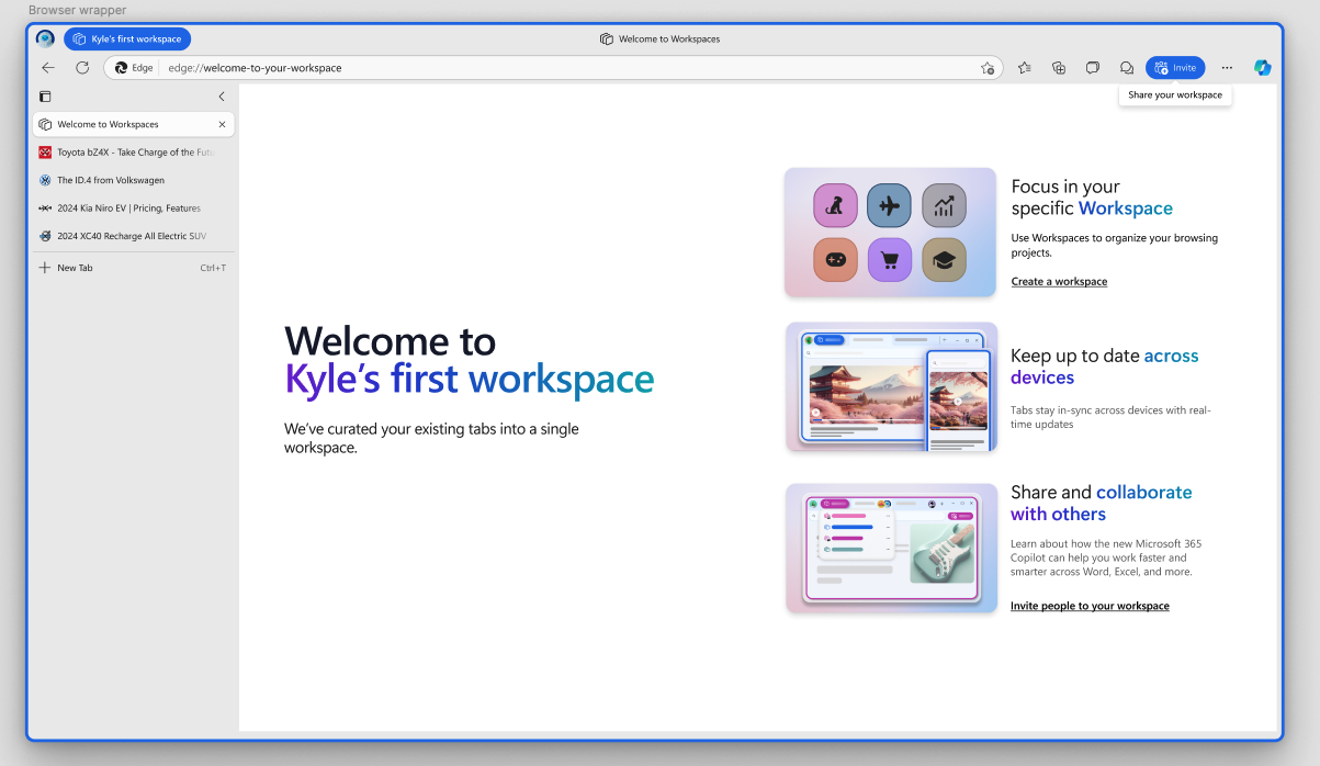
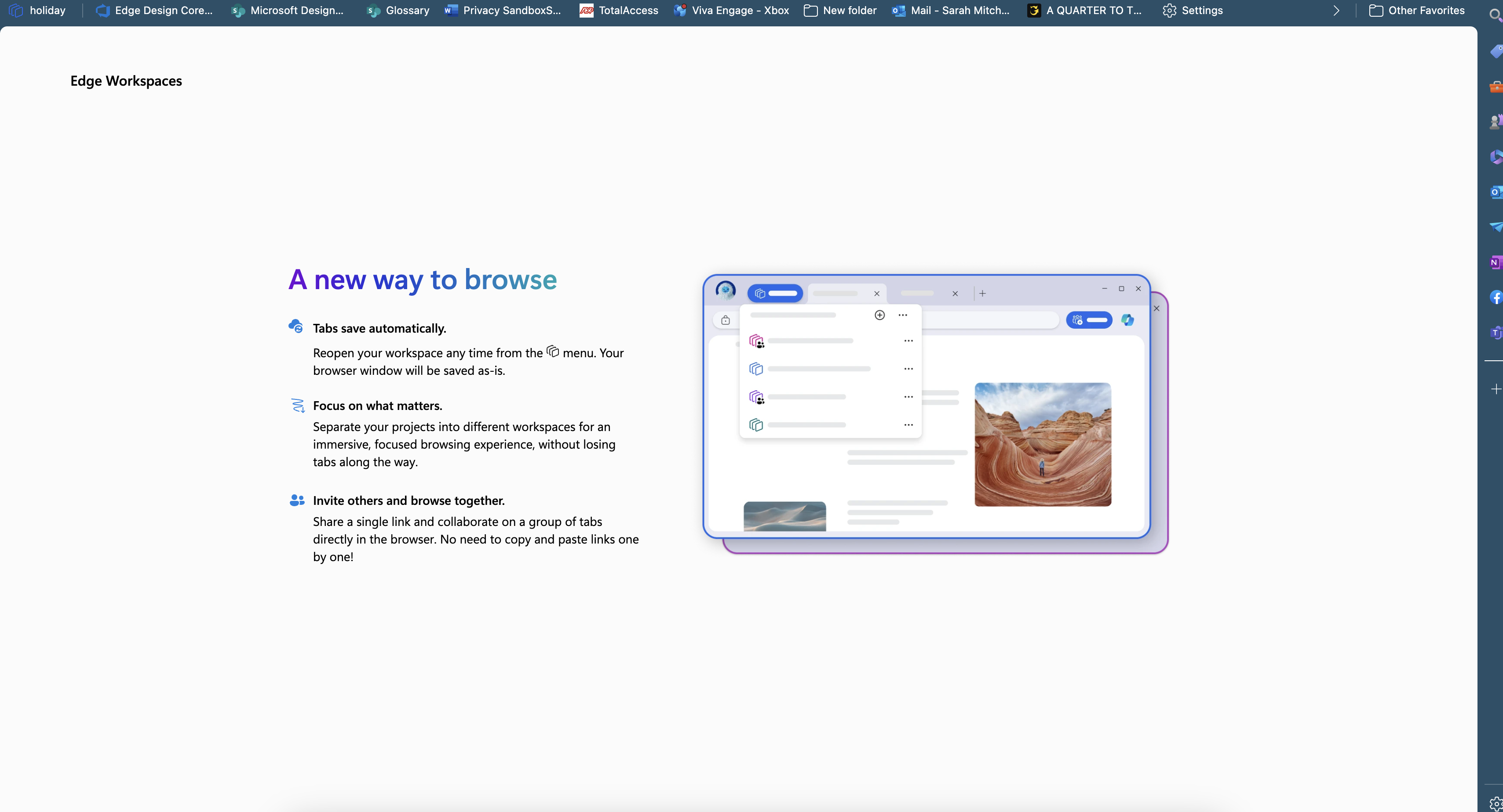
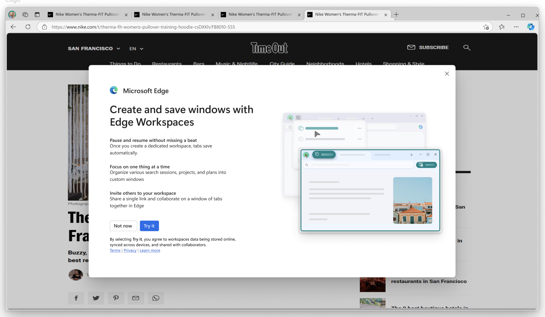
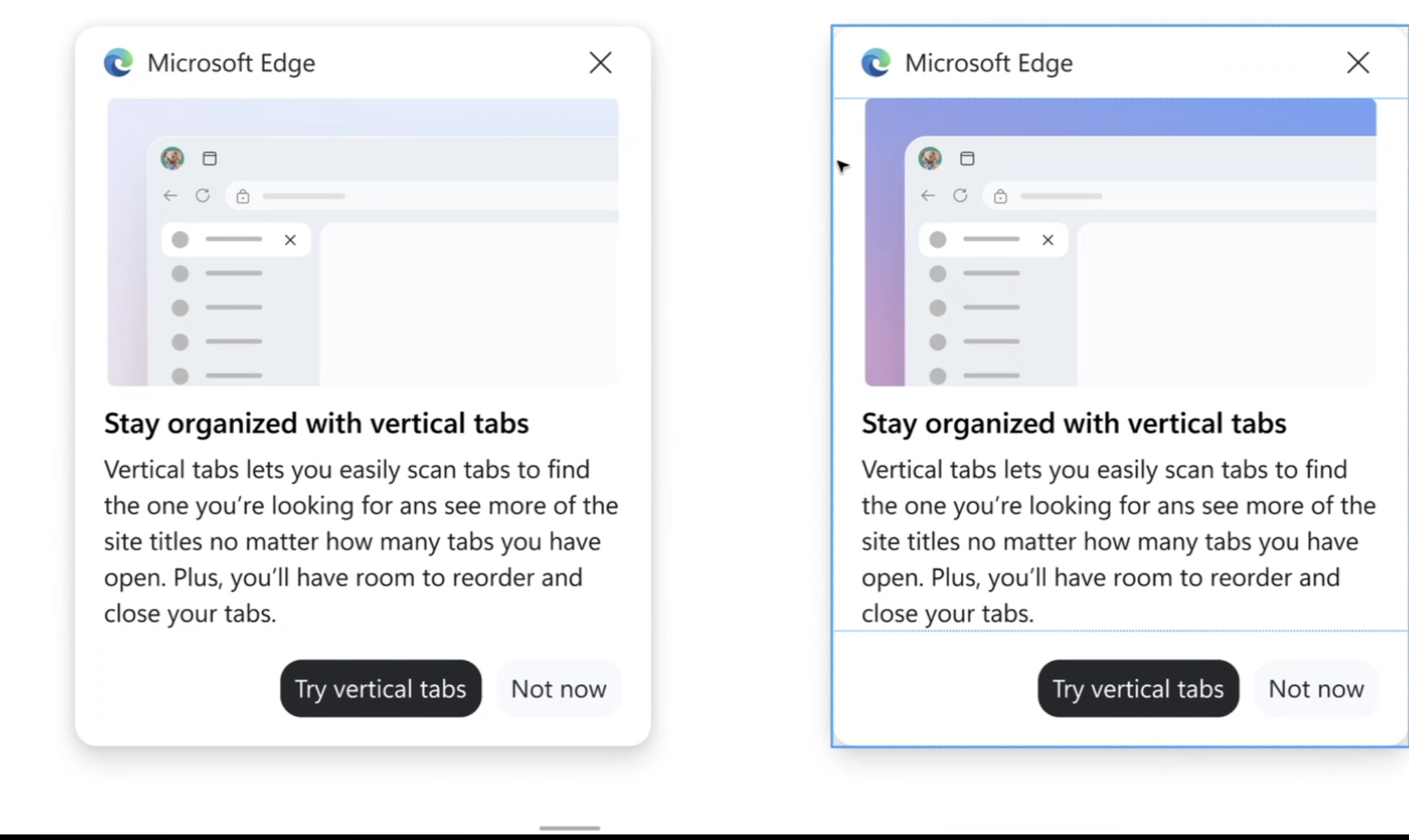
I worked on the V-team with Vertical tabs and created some upsell/educational moments, and try to use the UI to actually educate rather than sit in ambiguity. This style was also scaled to the wider companies illustration guidelines, because we utilised AI generation elements into it.