CONTEXT
Scareware is designed to exploit fear, urgency, and confusion to coerce users into unsafe actions. In a browser context, poorly interventions can fail to protect users or damage trust.
This case study brings together multiple trust and safety surfaces I worked on across Edge, including Scareware Blocker, Browser Essentials security flows, threat messaging, and related error and recovery states.
I was responsible for the UX design of key scareware and security intervention flows, with a focus on messaging, severity calibration, and recovery paths. I worked closely with PMs, engineers, and security stakeholders to balance user protection, false positives, and trust. This included:
Threat intervention flows
Messaging and language tone
Severity and visual emphasis
Error and recovery states
Cross-team reviews with security partners
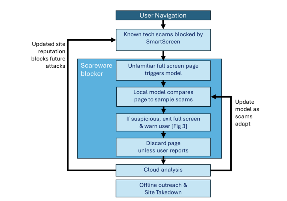
The central challenge was deciding when to intervene, how strongly, and how to help users recover safely—without amplifying fear.
Under-warning → users fall victim to scams
Over-warning → users stop trusting the browser
Ambiguous warnings → panic and unsafe decisions
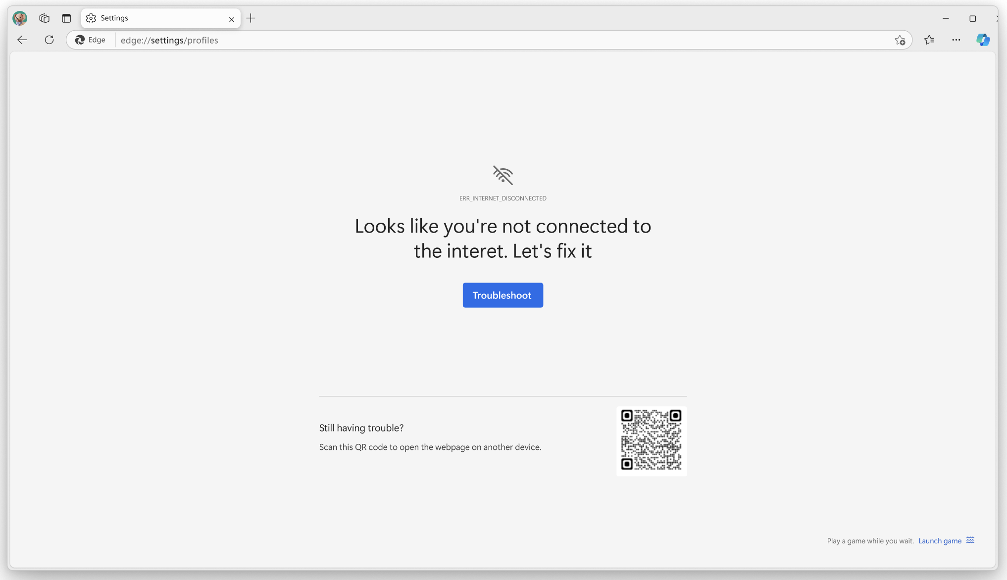
We already had some 'empty state' or 'error' page warnings but they didnt feel aligned, so I was very conscious to keep a regard for these pages to retain trust, but also this served as an opportunity to address these pages too.
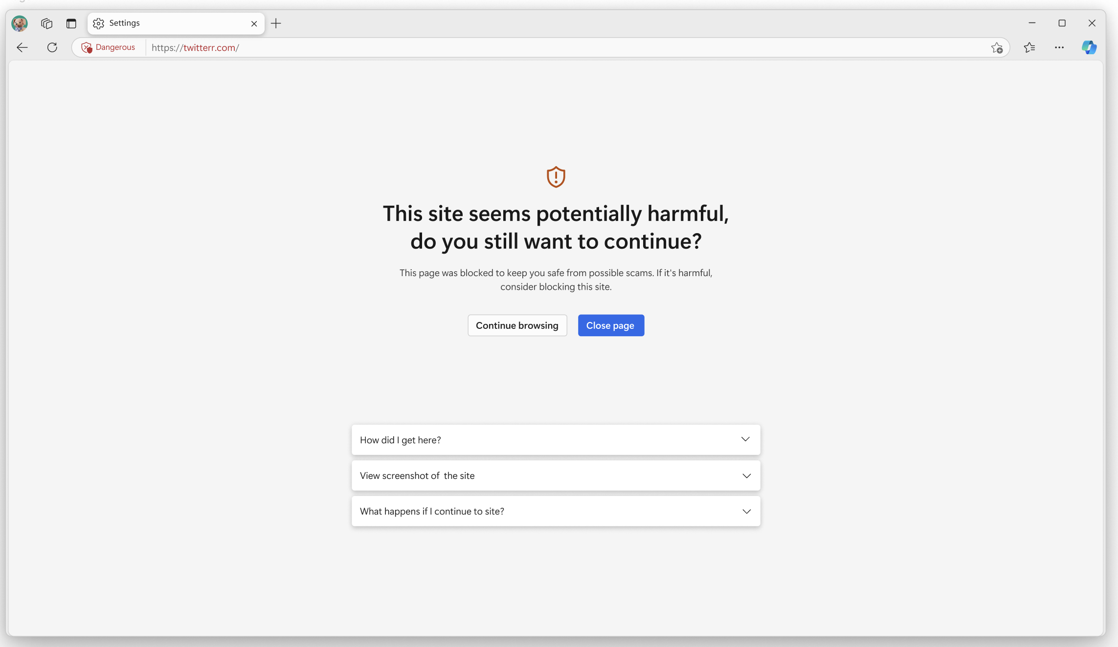
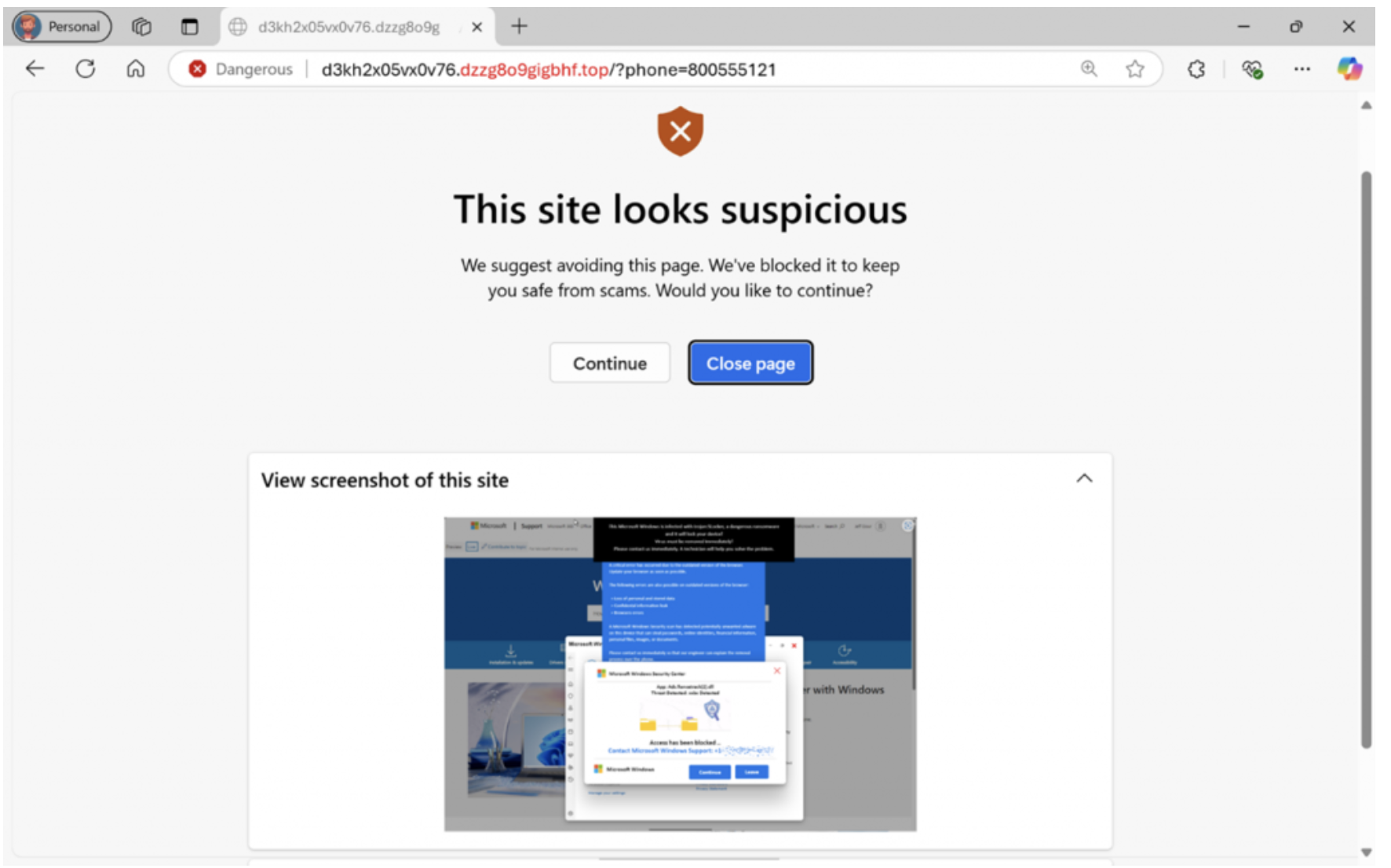
Because not all threats deserve the same visual weight I needed to convey that this was more of a 'potential risk', rather than a hard block, but slightly more important than an informational warning like a 404 error.
Finding the correct messaging That Reduces Panic, and avoids alarmist language was important. Sometimes there could be false positives rasied by the AI so it was important to me to leave the final choice to the user on wether to proceed or not.
From user testing it was most useful if we kept the screenshot of the site the browser was going to travel to on the screen so they had more of an infomred decision. Language was intentionally designed to slow users down rather than escalate urgency.
Design decisions were shaped by security accuracy limits and legal review, which constrained both language and interaction patterns.


I am super excited to read about how scareware blocker is helping users on the ground and it has been covered in a few press releases since its launch. This has been a particuarly important feature for me, because it will help a lot of users who are vulnerable stay away from scams.